
Nubart Team
Scrolling vs. clicking: how navigation design makes or breaks a digital audio guide
The way visitors navigate a digital audio guide matters far more than most museums
realize. While the multimedia content of an audio guide gets plenty of attention — scripts,
voice talent, images, videos — the underlying navigation model often goes unconsidered. Yet it
is this structural decision that materially affects how many tracks visitors listen to and how
deeply they engage with the exhibition.
This article examines the two dominant navigation
paradigms in web-based digital audio guides, explains why one is better suited to the museum
context — for reasons grounded in established UX principles — and offers practical guidance on
structuring content for clarity, personalization, and ease of use. It is intended as a reference
for museums, audio guide vendors, and UX designers working in the cultural sector.

From keypad to touchscreen: why structure matters now
With traditional audio guide devices, content structure was barely a concern. Visitors typed a number on a keypad, heard the corresponding track, and moved on. The device imposed no navigational decisions beyond "which number next?"
Digital audio guides — whether native apps or progressive web apps (PWAs) — changed this entirely. A touchscreen interface must present a list of available tracks, offer ways to find specific content, and sometimes accommodate supplementary media like videos, image galleries, or text. These capabilities are valuable, but they also introduce a design challenge that hardware devices never faced: how should visitors move between tracks?
The answer to that question splits today's digital audio guides into two fundamentally different navigation paradigms.
Two navigation paradigms in digital audio guides: scroll-and-play-in-place vs. click-and-navigate-away
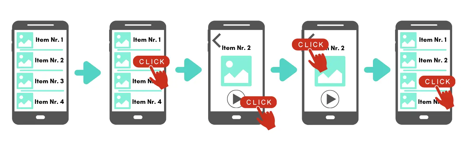
Many web-based digital audio guides follow what can be called the click-and-navigate-away model. The visitor sees a list of available tracks — often in a scrollable menu or bottom navigation bar. Tapping on a track opens it in a new view or screen. To choose a different track, the visitor must navigate back to the list, scroll to find the next item, and tap again. In many implementations, selecting another track requires returning to the list and reopening another item — at least two steps: one to leave the current track, one to arrive at the next.
This pattern is essentially desktop website thinking applied to a mobile screen. On a desktop computer, multi-page navigation works well: each page fills a large monitor, menus remain visible in a sidebar or header, and the back button is easy to find. But on a six-inch phone screen, held in one hand while standing in front of an exhibit, this architecture loses most of its advantages. The screen is too small to show meaningful context alongside the content, the back button competes with the browser's own controls, and every page transition disrupts the visitor's attention — attention that should be directed at the exhibition, not at the interface.
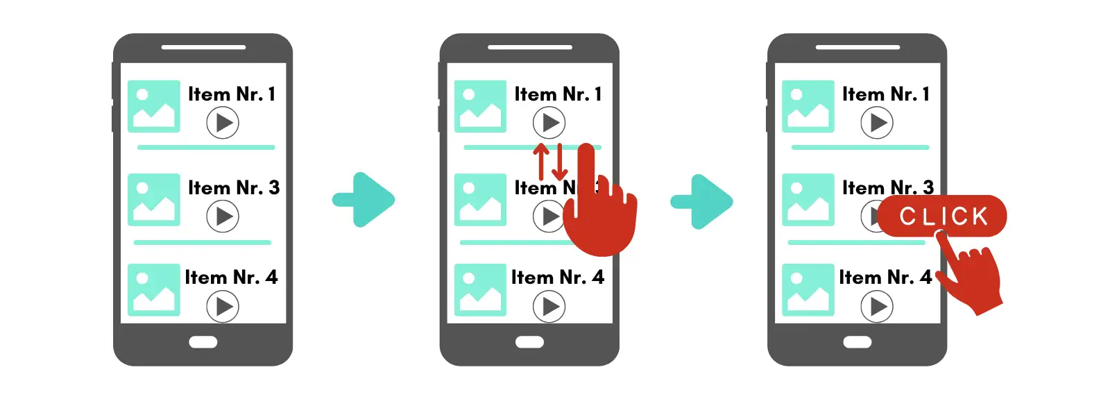
The alternative is the scroll-and-play-in-place model. Here, all tracks within a section are arranged in a single, continuously scrollable page. Tapping a track starts playback without leaving the page. The visitor can scroll up or down at any time to see what comes before or after, and can switch tracks with a single tap — no back-button, no page transition, no re-orientation needed. The result is a flow-based experience: browsing, selecting, and listening happen in one continuous interaction, without the constant interruptions that pull the visitor out of the exhibition and into the interface.
To be fair, most click-and-navigate-away guides do include a scrollable list view somewhere — typically in a bottom menu bar. But the crucial difference is that tapping an item in that list still takes the visitor to a separate, fixed screen. To scroll and browse again, they must return to the list. The scrolling and the listening happen in separate contexts.
In a scroll-and-play-in-place guide, scrolling and listening coexist on the same screen. This distinction may sound subtle, but its impact on usability is significant — especially for the diverse, often non-technical audience that uses audio guides in museums.
Why scroll-and-play-in-place works better: four UX arguments
1. Lower cognitive load through persistent spatial context
Cognitive load theory, originally developed by the psychologist John Sweller and widely applied in UX design, describes the mental effort required to process information and learn to use an interface. One of the most effective ways to reduce cognitive load is to minimize the information users must hold in working memory.
In a click-and-navigate-away model, every tap into a track breaks the visitor's spatial context. They leave the list, enter a new screen, and when they return, they must re-orient: Where was I? Which track was next? How many are left? Each of these micro-decisions adds to the cognitive burden — a burden that competes directly with the visitor's primary task, which is to look at the exhibition.
In a scroll-and-play-in-place model, this problem largely disappears. Because all tracks remain visible in a single scrollable list with persistent numbering, visitors always know where they are in the overall structure. Track 4 is always visibly between track 3 and track 5. There is no need to remember, because the information is always on screen.
This aligns directly with Jakob Nielsen's sixth usability heuristic: recognition rather than recall. Interfaces should make objects, actions, and options visible, so that users do not have to remember information from one part of the interaction to another. A scrollable, numbered list of audio tracks is a textbook implementation of this principle. A click-and-navigate-away model, by contrast, forces recall — the visitor must reconstruct their position from memory each time they return to the list.
There is a practical dimension to this as well. A scrollable list gives visitors an intuitive sense of the audio guide's overall scope — how many tracks there are, how far along they have progressed, and how much remains. This spatial awareness helps them budget their time: a visitor who can see they are at track 6 of 20 can decide to skip ahead or slow down accordingly. In a click-and-navigate-away model, the total volume of content is hidden behind the list view, making it much harder for visitors to gauge the scale of the guide or plan their visit around it.
2. Familiarity: scrolling is now a universal digital skill
Not every museum visitor is a digital native. Museum audiences span all ages and levels of technical comfort — from teenagers who navigate apps instinctively to retirees who may use only a few apps regularly. Designing for this range means choosing interaction patterns that are as universally understood as possible.
Scrolling has become precisely such a pattern. The vertical scroll is the dominant interaction model of the mobile era: social media feeds (Facebook, Instagram, TikTok), messaging apps (WhatsApp, Telegram), news sites, and email clients all rely on it. Even users who would describe themselves as "not good with technology" scroll through WhatsApp conversations and social media timelines daily. The gesture is habitual and requires no instruction.
Click-based navigation with back-buttons and screen transitions, on the other hand, represents a more complex interaction pattern. It requires understanding that tapping an item will replace the current view, that a separate action (back button, menu icon) is needed to return, and that the previous view's state (scroll position, context) may or may not be preserved. For visitors unfamiliar with this pattern — or simply not paying close attention because they are focused on the art — it becomes a source of friction.
An audio guide that relies on scrolling to browse tracks and a single tap to play — without ever leaving the page — leverages the interaction model that the broadest possible audience already knows.
There is also a physical dimension to this. For seniors or visitors with motor impairments, precision-tapping small back buttons or menu icons is a high-effort task that is easy to get wrong. Scrolling, by contrast, is a low-precision gesture — a broad swipe of the thumb, forgiving of imprecise input and difficult to execute incorrectly. In a museum context, where a significant share of the audience may be older adults, this difference in gestural effort is not trivial.
A note on accessibility: scrollable interfaces sometimes have a poor reputation because of the well-documented problems with infinite scroll patterns in social media and e-commerce, which trap screen reader and keyboard users in a never-ending page with no landmarks or predictable structure. But an audio guide is not an infinite feed. It is a finite, numbered list of tracks with a clear beginning and end. When built with proper semantic HTML — headings, landmark regions, and consistent content structure — a scrollable audio guide page can be straightforward for assistive technologies to navigate. In practice, this means using a heading for each stop, consistent numbering in the visible text, landmark regions for the main content area, and predictable keyboard focus when search or filters move the user to a different track. By contrast, a click-and-navigate-away model that constantly opens and closes separate views, modals, or pseudo-pages can — if not implemented with great care — disrupt focus management and disorient screen reader users, which is one of the most common accessibility pitfalls in mobile web applications. For a full picture of how Nubart approaches accessibility in its audio guides, see our article on accessible digital audio guides for museums.
3. Incidental discovery: scrolling supports the museum's educational mission
A well-designed digital audio guide does not just illustrate the exhibits a visitor already planned to see — it can also lead them to things they did not know existed. This capacity for incidental discovery is one of the most underappreciated advantages of the scroll-and-play-in-place model.
In a scrollable audio guide, each track is typically represented by a thumbnail image alongside its number and title. As visitors scroll to find or listen to a specific track, the thumbnails of adjacent tracks are always visible in their peripheral visual field. A striking image, an unexpected title, an intriguing exhibit they walked past without noticing — any of these can catch a visitor's eye and prompt them to explore a track they would never have actively searched for.
In a click-and-navigate-away model, this kind of passive discovery is far less likely. Once a visitor taps into a track, the dedicated screen shows only that track's content. Adjacent tracks are invisible until the visitor navigates back to the list and deliberately scrolls. Content that the visitor did not already intend to find effectively ceases to exist.
This matters because one of the core missions of any museum is to educate — to expand visitors' horizons beyond what they came to see. A scrollable interface with visual thumbnails acts as a kind of passive recommendation system, continuously exposing visitors to content they might otherwise miss. It does not require algorithmic personalization or push notifications; the simple act of scrolling past neighboring tracks is enough. Whether the discovery happens during the visit or later — since many web-based audio guides remain accessible after leaving the museum — the result is the same: a richer, more expansive experience that aligns the guide's UX directly with the institution's educational purpose.
4. Compatibility with search and direct access features
A common concern about scroll-based interfaces is that they might not accommodate structured navigation features — such as searching for a specific track by number or by keyword. In practice, the opposite is true: scroll-and-play-in-place interfaces integrate these features seamlessly, often more elegantly than click-based alternatives.
When a visitor enters a track number on a keypad or uses a text search, the interface simply scrolls to the corresponding position. The visitor arrives at the right track within the familiar, continuous context of the full list — not on a separate screen stripped of surrounding context. After listening, they can scroll up or down to explore adjacent tracks without any additional navigation step.
This means that a well-designed scrollable audio guide offers the best of both interaction models: the free-form browsing of a continuous list and the direct-access precision of a search or keypad function, unified in a single, consistent interface.
Structuring content within a scrollable audio guide
Choosing the scroll-and-play-in-place model answers the navigation question, but it does not resolve a second, equally important design challenge: how to organize the content itself. A museum with dozens or even hundreds of audio tracks cannot simply dump them all into one endless scroll. The content must be grouped logically, in ways that help visitors orient themselves physically within the exhibition space.
Match the structure to the physical space
The most important structural principle for any audio guide is to align content groupings with the physical layout of the venue. If exhibits are spread across three floors, the audio guide should reflect that with three clearly separated sections. If a heritage site comprises several buildings, each building should correspond to a distinct content block.
This may seem obvious, but it is a mistake many audio guides make — particularly when curators prefer to organize content thematically or chronologically. A thematic grouping can be intellectually satisfying, but if medieval artifacts share a gallery with modern-history displays, an audio guide that separates them into different thematic lists will confuse visitors trying to match what they hear with what they see. Physical proximity should take priority over thematic coherence when the two conflict.
Use modules for complex or multi-site venues
For venues with clearly distinct areas — separate buildings, indoor and outdoor sections, permanent and temporary exhibitions — a modular approach works well. Each module is its own scrollable section with its own track list, and visitors can switch between modules via a clear, top-level menu.
This modular system keeps each individual scroll manageable in length while accommodating the full breadth of a complex venue. For example, a mining park with a museum, a historical train, an underground mine, and a period house can present four separate modules, each with its own logical structure and numbering — all within a single audio guide. Similarly, a museum hosting both a permanent collection and rotating temporary exhibitions can assign each exhibition its own module, adding or removing them as shows change.
The key is that within each module, the scroll-and-play-in-place model remains intact. Modules organize the macro-structure; scrolling handles the micro-navigation.
Personalization without breaking the scroll
One of the strengths of digital audio guides over traditional devices is the ability to adapt content to different visitor profiles. Not every visitor wants the same depth of information: some want a quick highlights tour, others want to spend an hour examining a single display case. The challenge is to offer this flexibility without cluttering the interface or breaking the simplicity of the scrollable structure.
Expandable detail within each track
The most effective solution is progressive disclosure — a well-established UX principle that presents only essential information upfront and reveals additional detail on demand. In the context of an audio guide, this means each track can include a collapsible section (often labeled "More information") that visitors can open if they want deeper content: a second audio commentary, a video, an image carousel, a downloadable PDF, or a link to further reading.
The crucial point is that opening this additional content does not navigate the visitor away from the track list. The expansion happens in place, within the scroll. When the visitor is done, they collapse the section and continue scrolling. The guide's overall structure remains visible and intact at all times.
Transcriptions and text content: overlay, don't embed
The same principle of progressive disclosure applies to a detail that many audio guide providers get wrong: where to place the transcription or written text associated with a track.
A common approach is to display the full text directly below the play button, inline with the track. This creates two problems. First, it makes each track visually very long, pushing neighboring tracks far out of view and undermining the spatial awareness that makes scrollable guides effective. Second — and somewhat ironically — it forces the visitor to scroll extensively within a single track's content, while making it harder to scroll across tracks. The vertical space that should serve navigation gets consumed by text.
A better solution is to present transcriptions and other text-heavy content in a closable overlay or pop-up window. The visitor taps to read, and the text appears on top of the track list. When they close it, they return to exactly the position they left — no scrolling back, no re-orientation. The track list underneath remains undisturbed, and the guide's structure stays intact. The underlying principle is straightforward: the vertical track list should remain short and scannable, and heavy text or media belong in overlays rather than inline. Or, put more simply: keep the scroll sacred, and let everything else happen in layers on top of it.
Tags for filtering content
For very large collections or venues that serve diverse audiences, a tag-based filtering system adds another layer of personalization. Visitors can filter the track list by interest — for example, "highlights only," "family-friendly," "architecture," or "contemporary art" — and the scrollable list dynamically adjusts to show only the relevant tracks.
This approach serves two complementary purposes. It can limit the content for visitors who want a shorter, more focused experience (such as a 30-minute highlights tour of a large national museum), and it can extend the content for specialists who want to explore a particular theme in depth. In both cases, the visitor remains within the same scrollable interface, and the spatial logic of the guide remains coherent.
The special case of geolocation-triggered scrolling
An advanced extension of the scroll-and-play-in-place model is automatic scrolling triggered by the visitor's location. Using geolocation, the audio guide can detect when a visitor approaches a particular exhibit and automatically scroll the corresponding track to the top of the screen. The visitor does not even need to search, scroll, or tap — the right content appears at the right moment.
This represents the logical endpoint of the scroll-based paradigm: an audio guide that requires zero active navigation from the visitor, while still preserving the full track list as a visible, browsable reference at all times. The visitor retains full control — they can still scroll manually, jump to a different track, or use search — but the default experience is entirely frictionless. Naturally, this feature depends on the visitor granting location permissions, and GPS accuracy can be limited indoors — which is why it works best as an enhancement to manual navigation, not a replacement for it.
Summary: what makes an audio guide structure user-friendly
The structure of a digital audio guide is not a secondary concern — it is a core design decision that directly affects how many visitors use the guide, how many tracks they listen to, and how positively they remember the experience. The key principles are:
Navigation model: A scroll-and-play-in-place interface reduces cognitive load, leverages universally familiar interaction patterns, and integrates seamlessly with search and direct-access features. It is better suited to the museum context than a click-and-navigate-away model, particularly for non-technical audiences.
Content structure: Track groupings should mirror the physical layout of the venue. Complex or multi-site venues benefit from a modular system that organizes the macro-structure while preserving scrollable micro-navigation within each module.
Personalization: Expandable detail sections and tag-based filtering allow visitors to customize depth and focus without leaving the scrollable interface or losing spatial orientation.
Assisted navigation: Geolocation-triggered scrolling extends the model to its most frictionless form, automatically presenting relevant content based on the visitor's physical position while keeping the full guide browsable at all times.
These principles are not specific to any one product or platform. They reflect well-established UX heuristics — particularly the principle of recognition over recall and the practice of progressive disclosure — applied to the specific constraints and audience of the museum audio guide context. Several providers, including Nubart, have adopted the scroll-and-play-in-place model as a default for their web-based audio guides, precisely because it fits the museum context and diverse visitor base described above.